Last time, I put up a couple calculators to help you understand your personal exchange rate for retirement days and money. Here, I’ll walk you through making your own awesome spreadsheet so you can have those calculators (and more) at your disposal.
Buckle up - you’re about to amp up your spreadsheet skills :) (Tweet this )
The Goal
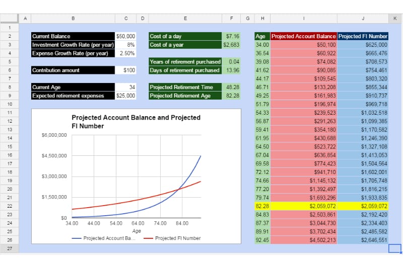
It’s got everything from last week’s online calculators and then some; here’s what we’re going to make:

Beyond calculating the cost of a day of retirement and the impact on retirement time of a given contribution, we’re going to plot out the retirement account balance against the target balance and put it all in a nice interactive dashboard.
If you are having trouble getting the sheet put together, he’s a completed version on Google Drive that you can use for reference. If you go here, it’ll prompt you whether you want to make a copy of this sheet. This way you can modify the sheet to your heart’s content without changing the master copy for other readers.
Set Up
You can use just about any spreadsheet software to put together this tool, but I’m going to be using Google Sheets (it’s free!). Microsoft Excel is another good option. If you only care about the calculator portion, either should work fine for this tutorial. For the part where I turn everything into a pretty dashboard, I’m only going to show the steps in Google Sheets.
Part 1 - Compute Impact of a Contribution
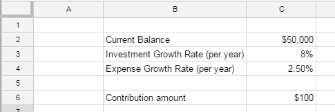
First, create a section where you can put in the known “inputs” (Current retirement account balance, expected investment growth, and expected expense growth AKA inflation). Add the titles and some example data like this:

Next, create a field where you can put in the dollar amount you’re considering contributing (whether that be the retirement savings amount you get to your 401k for 1 day’s work or an additional amount you’d consider putting in).
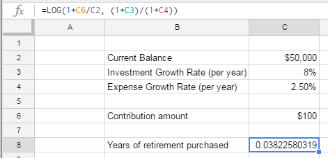
Now you can set up the formula for computing the amount of time that contribution pulls in your retirement date (we’ll do this in years first and then convert to days):
If you’ve set up the table like i did, the formula will be this:
=LOG(1+C6/C2, (1+C3)/(1+C4))
In most cases your impact won’t be on the order of years, so lets convert this to days to make it a bit more tangible
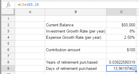
Ai chiuahua! 14 days for $100? I don’t know about you but $100 for two weeks of retirement sounds like a pretty sweet deal to me!
Now you can change C6 to your heart’s desire and see what impact you can make with different amounts. Also, if you make different assumptions on investment growth or inflation, feel free to change C3 and C4 to suit your preferences.
We’ve got the impact of a known amount down, so now lets use the other equation to figure out the cost of a day of retirement.
Part 2 - Compute Cost of a Day of Retirement
The nice part here is that we can use the same initial data (B2 to C4) in our new formulas. Thus, we can put in our cost of a day formula
=C2*(((1+C3)/(1+C4))^(1/365.25)-1)
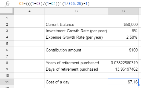
$7.16 isn’t bad - that’s about the cost of lunch at a chain restaurant. If you bag your lunch instead for one day, you can retire a day earlier :)
In this case it might be nice to see what a year would cost just in case you find a briefcase full of cash lying around.
=C2*(((1+C3)/(1+C4))^(1)-1)
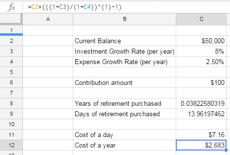
And there we have it.
I don’t know if you agree but, aside from figuring out what the formulas should be, this seemed too easy. Let’s juice this up with a predicted retirement date
Part 3 - Compute Retirement Date
This would be a lot more fun if this included what your actual retirement age is (presuming no more contributions).
We’re going to need a few more inputs here to make this worthwhile - current age and expected retirement expenses (in today’s dollars).

Here’s the formula the years after which your retirement account gets big enough to meet the 4% safe withdrawal rate:
=LOG(25*C15/(C2+C6), (1+C3)/(1+C4))
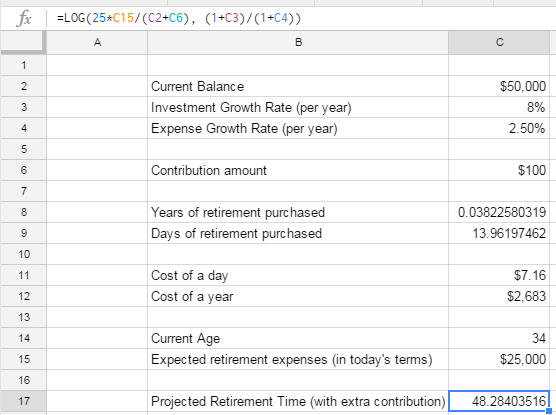
For Projected Retirement Age, we can just add our current age to the projected retirement tie we just computed
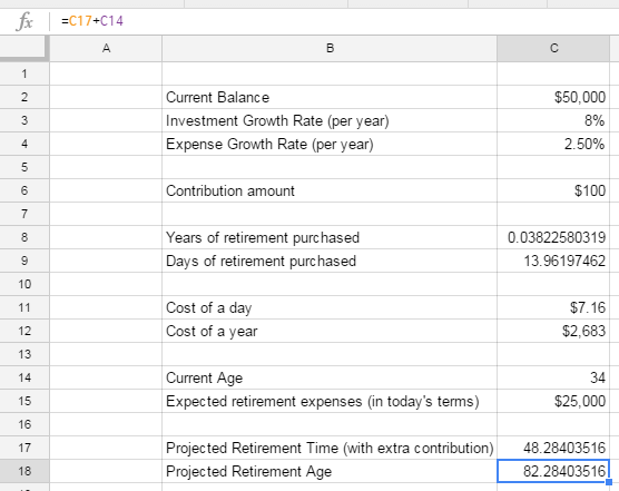
Retiring at just over age 82 doesn’t sound great, but keep in mind - this is if you don’t make any more contributions to your retirement savings.
You’re certainly going to do that, right? Especially now that you’ve seen how cheap it is to bump that date up?
The reason we’re computing things this way is to isolate the impact of today’s contribution.
Part 4 - Chart All the Things
Let’s be honest, every spreadsheet is better with a chart
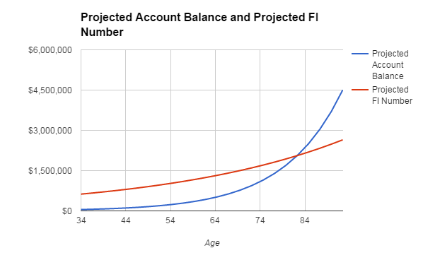
With that in mind, let’s get something fun set up here - let’s show a chart of your investment catching up to and eventually surpassing the amount you need to retire.
First, we’ll build the data table. We’ll be using a scatter plot where the x-axis is your age and the y-axis is an amount of dollars. We’ll be plotting both your projected retirement account balance and your projected retirement account needs. Where the two lines intersect is our financial independence (FI) point.
To give ourselves some space to work with, let’s build the data table starting in cell E2 with some headings:

To make the data plot nicely, we’ll want a fair number of data-points; Let’s use 24.
Our goal will be to have points 1-21 be from your current age to when your account hits financial independence and then a few data points after that for dramatic effect (to show the crazy power of compounding in action)
Lets set up the first cell in our age column: E3 should just pull from your current age (cell C14).
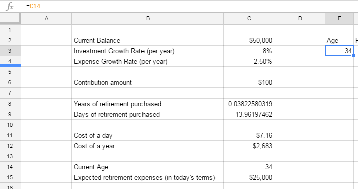
We then want to have E4 be 1/19th of the way between your current age and your FI age; E5 will be 2/19ths of the way there, and so on.
Here’s the formula for E5:
=E3+$C$17/19

We’re taking the prior datapoint (E3) and adding 1/19th of our retirement timeline. The nice part about setting it up this way is that the chart is now dynamic. As our age or timeline changes, the chart will update automatically.
You’ll notice the $ signs before the C and 17 in that formula. If you’re not familiar with them, these are really helpful for use in copying and pasting in spreadsheets (which is how you can make an awesome spreadsheet without spending too much time). The $ signs make an “absolute reference” which means that no matter where I copy and paste that formula, it’ll always refer to C17.
To see this in action, put the cursor on E4, copy the cell (ctrl-C on Windows; command-C on Mac), then put the cursor on E5 and paste (ctrl-V on Windows, command-V on Mac)

If you look in the formula bar, you’ll notice that the cell still refers to C17 but the reference to E3 was updated to E4 when we pasted it.
Note: By default, references are “relative” meaning if you move a row down and paste, the reference will refer to a row lower than the original. The same goes for moving up, down, left, right, or any combination.
Knowing how to use relative and absolute references properly is one of the biggest skills productivity tricks in creating spreadsheets. If you can master this, you can use copy and paste with grace, saving a ton of time manually entering formulas :)
From here, copy E5 and then highlight E6 to E28 and then paste. All of the cells fill in and you’ll see we’ve got from our starting age (point 1 in cell E3) to our retirement age (point 21 in cell E23) to 3 points after (points 22-24 in cells E24:E27)
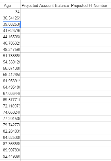
Awesome! Now we’re going to fill in Projected Account Balance.
Point 1 (F3) is easy - just grab the value in C2 plus our contribution amount in C6

For point 2 (F4), we want to calculate the size of the account after the first time chunk’s investment growth.
Here we use our Investment Growth Rate, compounded over the time period
=$F$3*(1+$C$3)^(E4-$E$3)

Again, we’re taking advantage of absolute references here. We are using the original investment amount ($F$3) and multiplying it by the growth rate (1+$C$3) to the exponent of the number of years passed (E4-$E$3).
The only thing that will change here when we copy and paste this formula is the number of years passed, which makes sense for what we’re trying to accomplish.
Copy what’s in F4 and paste it in F5 through F26
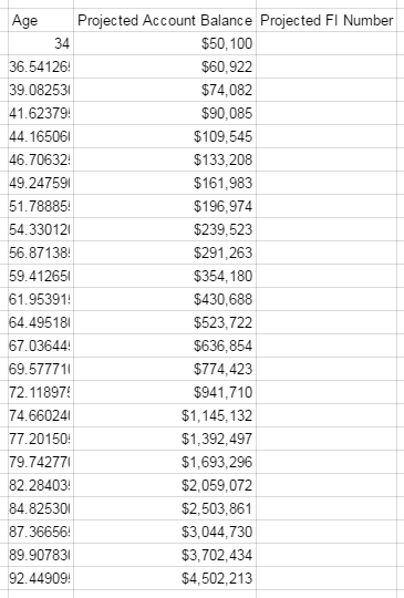
Compounding in action my friends. That piddly $50,000 becomes $2 million at your financial independence age
Now it’s time to fill out the Projected FI Number column. We’ll know we’re on the money (pun intended) if our value in G22 (the Projected FI number at age 82.28) is that same $2.059 million dollar value.
The structure here is the same as our projected account balance, except instead of using the current balance and investment growth rate, we’re using the expected expenses and expense growth rate:
Our first projected FI number is 25 times our expected retirement expenses (based on the 4% safe withdrawal rate)
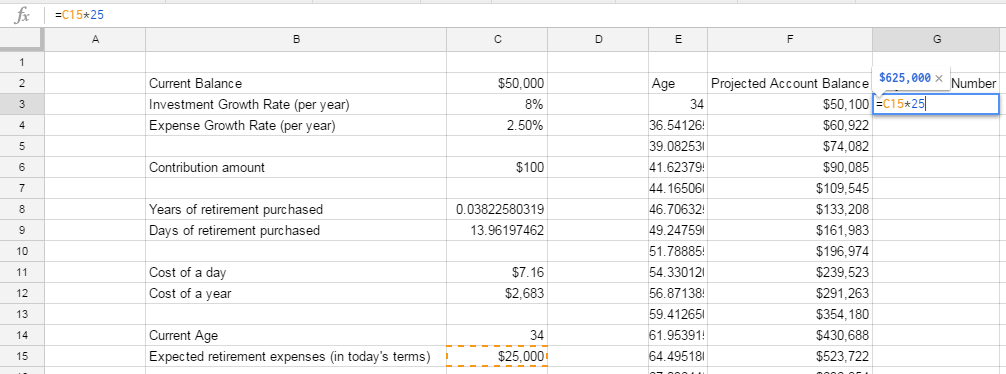
Our second point is very familiar to what we just saw in the Projected Account Balance column:
=$G$3*(1+$C$4)^(E4-$E$3)

Copy and paste this for G5 through G26 and we’re all set up!
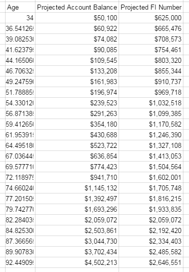
Looks like we did it right - our values line up at 82.28 years!
Now for the fun part - the chart :)
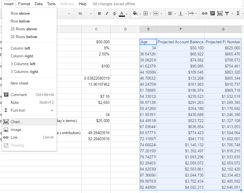
Highlight the whole table of data and insert a scatter plot (or X-Y) chart. If you’re in Google Sheets, click “Insert” and then “Chart”; the first recommended option is what you’re looking for.
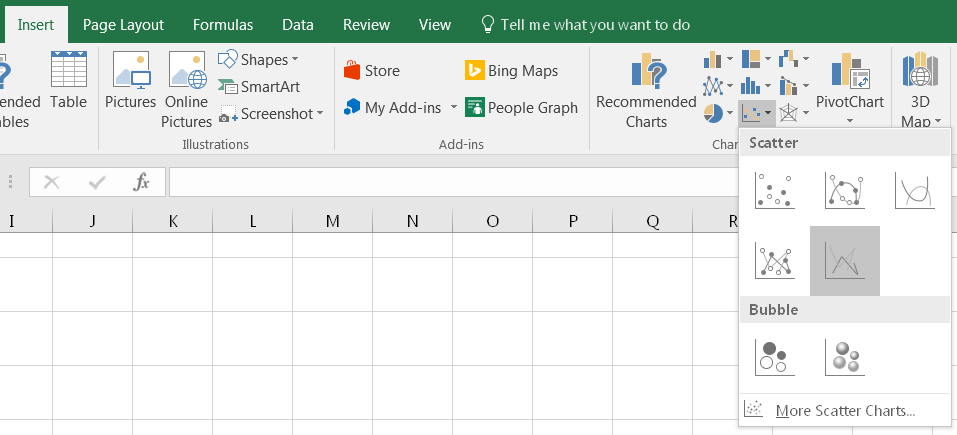
If you’re in Excel, go to the insert tab and find the chart that looks like a bunch of dots; select the one below:
Either way, you’ll end up with something like this:
Awesome job!
At this point, you could consider yourself done - you’ve got a functional spreadsheet that has everything we wanted to create for today.
That said, I always like at this point in a project to make things look just a bit more presentable.
A good looking spreadsheet is one you’re more likely to go use and maintain.
Extra Credit - Prettying It Up
One thing I can’t stand about most spreadsheets I see is how ugly they are. If we’re presenting cool information, we should make it look cool as well :)
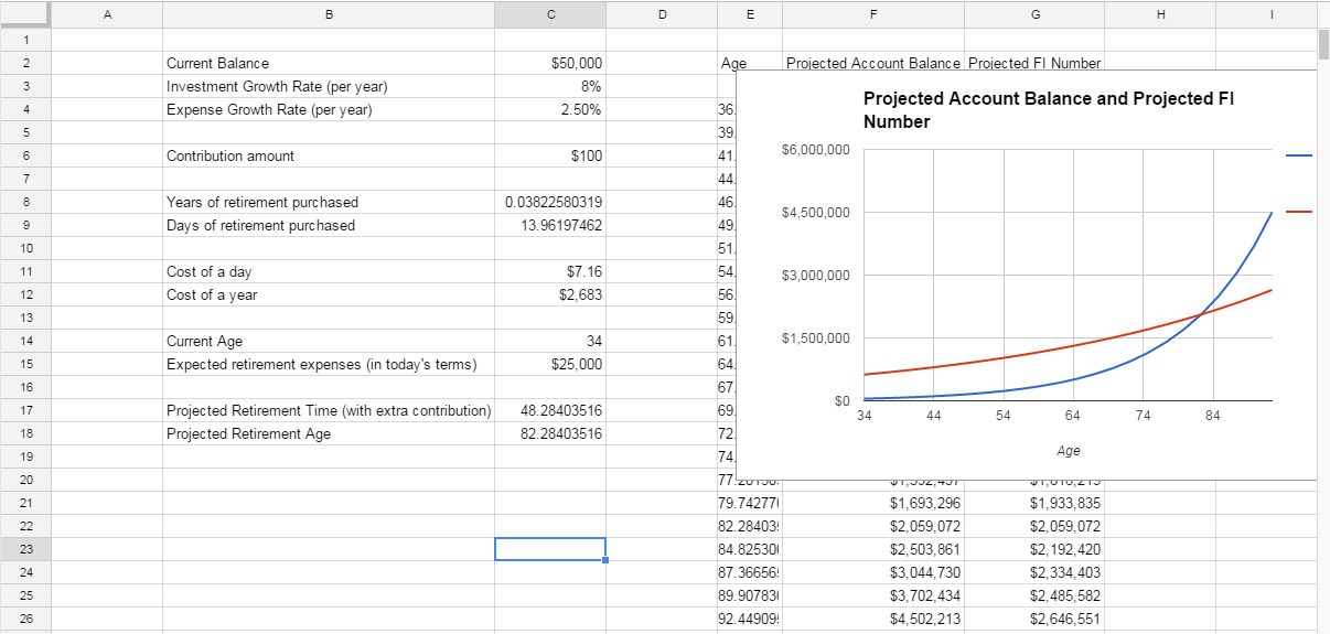
If you followed my instructions on Google Sheets, your sheet should look something like this:

It’s functional but it certainly could be prettier. Perhaps most importantly, if I came in to this sheet 6 months from now without having looked at it, I’m not convinced I’d know what to modify and how to read the data.
While not a work of art, here’s the finished product we’re going to be working toward:

Step 1 - Rearrange
One of the biggest problems with this sheet the way it stands is the fact that inputs and outputs are mixed together - it’s not clear what you’re supposed to enter vs what you’re supposed to read.
Let’s make a place for everything and get everything in its place. This is where cut (ctrl-X on Windows, command-X on Mac) and paste (ctrl-V on Windows, command-V on Mac) are your best friends.
First move the chart to below the list of inputs so it’s not blocking our data table. Click on the chart once and then click and drag to move it to a new home.
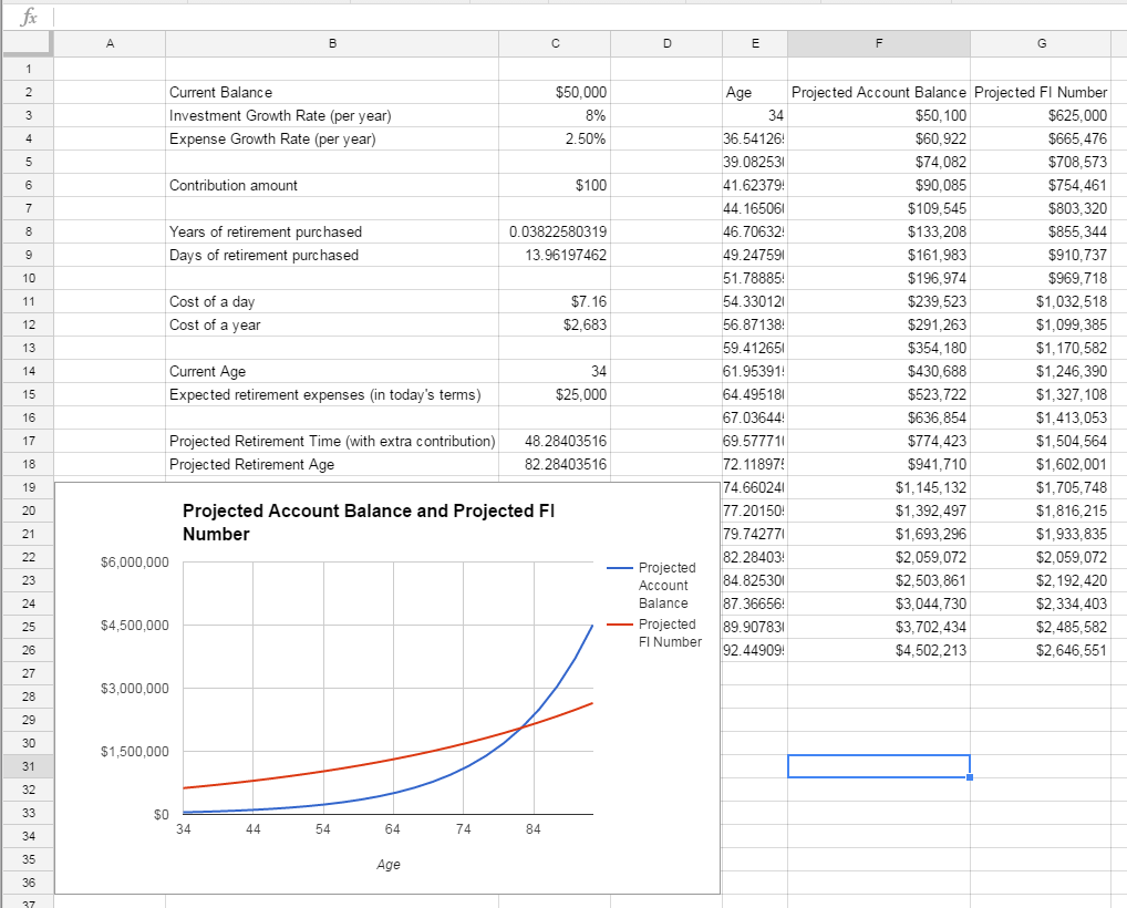
Now, let’s move the data table over to the right so we’ve got some more room. Highlight the whole table and then cut (ctrl-x on Windows or command-x on Mac), move your cursor to H2 and paste (ctrl-v on Windows or command-x on Mac).
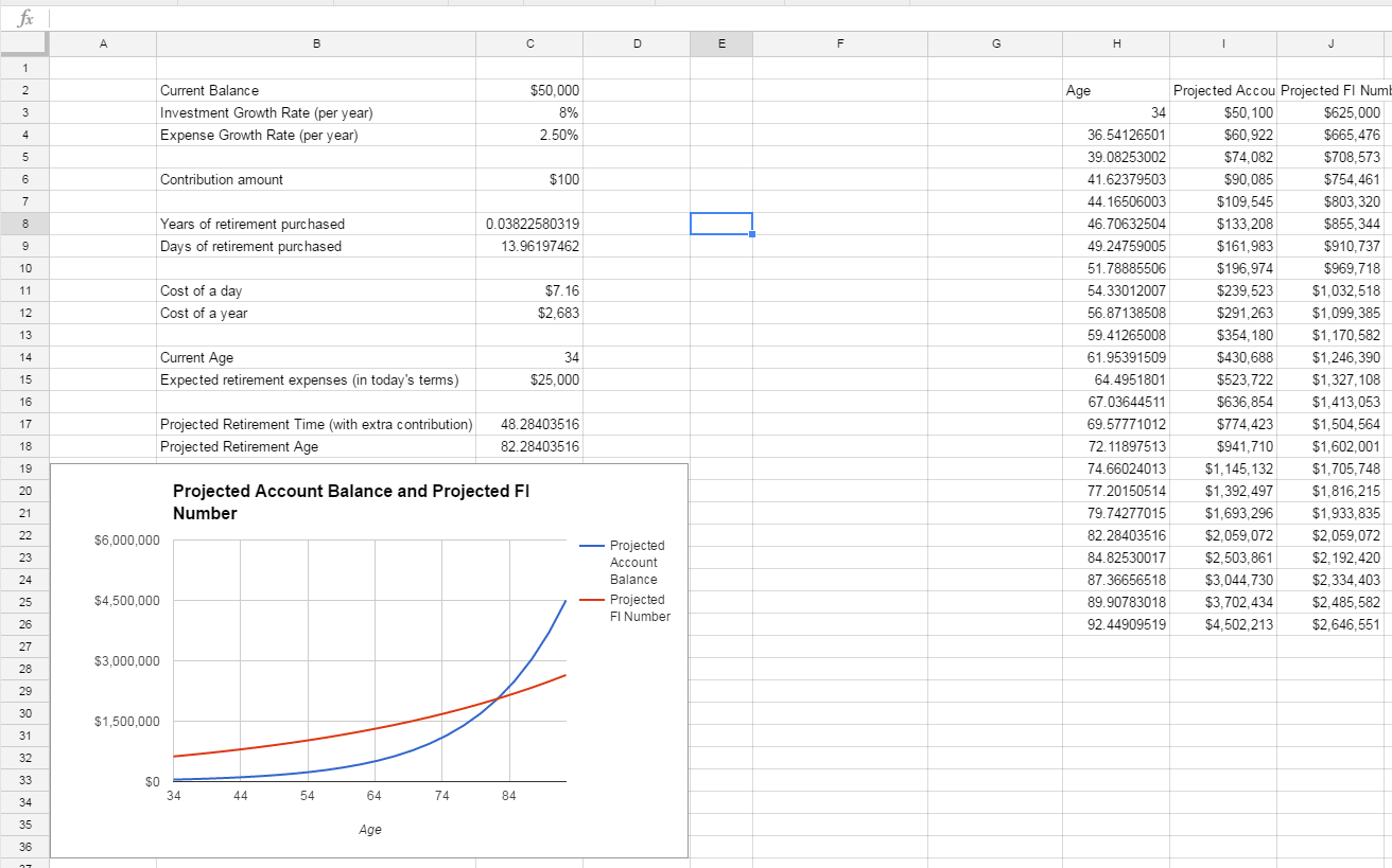
Next, let’s take the opportunity to group our inputs in one spot and outputs in another.
We’ll make columns B and C our input columns and use E and F as output columns with D providing some visual spacing.
Cut and paste each input and output (along with their labels) to put them in this order:

That’s a bit better. Now we can move our chart to sit more nicely in the open space. Move it there and then resize it so it fits by clicking on the chart, finding the square on the right side of the chart, and clicking and dragging until the chart is the right size.
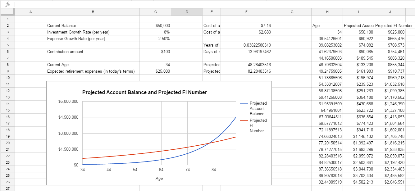
This is looking quite a bit better. Next, we’ll fix some number formatting and column width issues that are making parts of the sheet look a little awkward.
Step 2 - Number Formats and Sizing
First, let’s make sure the number format for all our cells makes sense.
So far, all of our dollar amounts look good - it’s mostly the ages in the data table and in our outputs that show way too many decimals to be useful.
Highlight them all (hold shift and click on individual cells or click and drag to select sets of cells) and change the formatting to “Number” (which gives 2 decimal places by default)
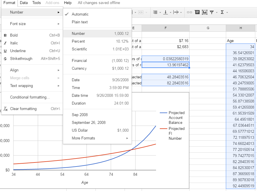
You can then auto-resize the column widths by highlighting the whole sheet (click the gray box above row 1 to the left of column A) and then double-clicking on one of the lines between two columns.
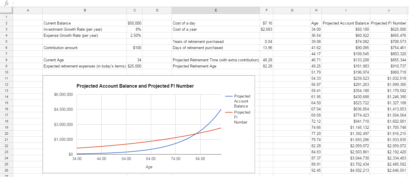
Things are progressing nicely but we’ve still got a bit of work. Some of our labels are making columns extra-wide so we have to decide if the wording is worth it. Cells B9 and E8 have wording in parentheses that I think can go. Let’s take those out and then re-size the column widths again like we just did a minute ago.
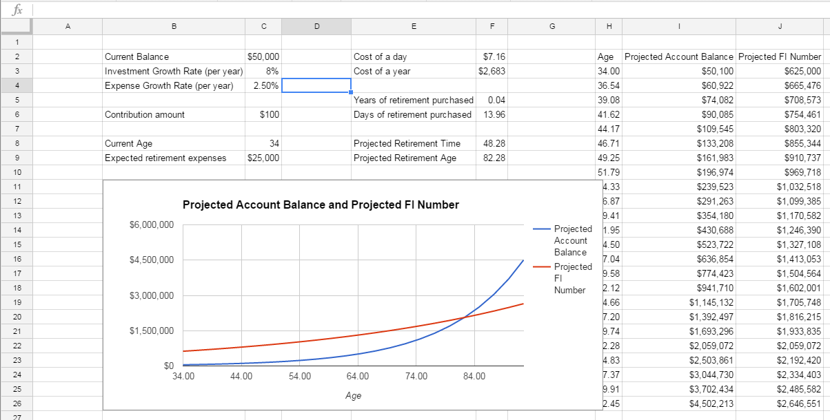
I like to have some visual spacing around my spreadsheet elements, so let’s create a “border” around our dashboard. We’ll resize columns A and K - shrink their size by clicking on the line to the right of each column heading and dragging to the left until we get the right size.

We also don’t need columns D and G to be as big. Some visual whitespace is good, but shrink those down similarly to what you just did for A and K.
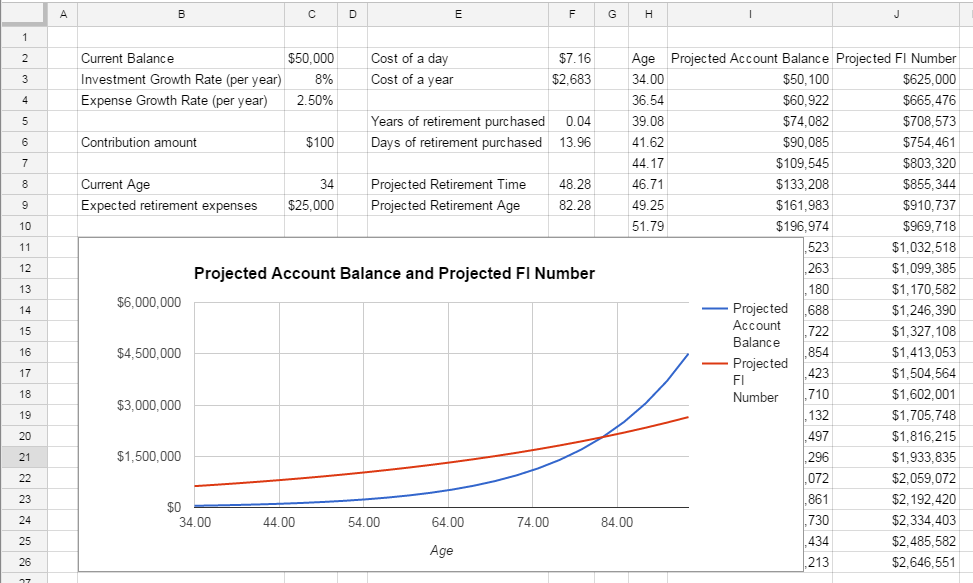
Now we need to shrink down our chart and our layout is starting to look pretty good. Click on the chart and drag the right side to just cover Column F.
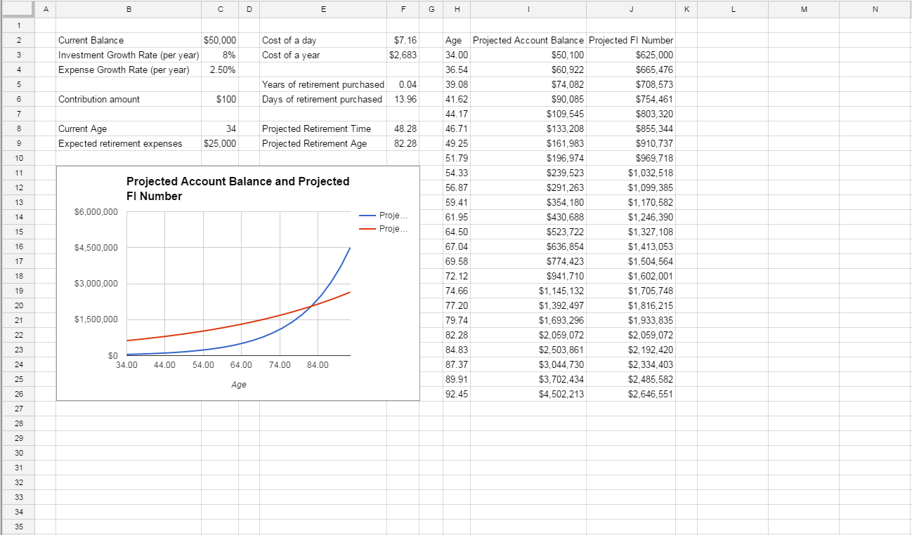
The final trick here, which is one of my favorites, is to remove the extra whitespace in the columns after K and rows after 27.
In Google Sheets, you can delete these which makes your sheet look just the right size and saves space on Google’s servers :)
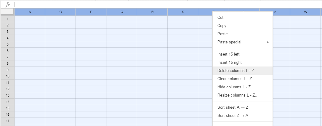
Click on the L at the top of column L, hold down shift and control and then hit the right arrow key. You can let go of all of them now as you’ve got all the columns highlighted. Right click somewhere in the column heading bar and select “Delete Columns L - Z”
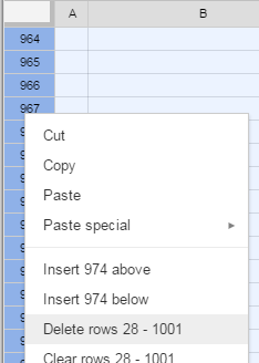
You can do the same for the rows by highlighting row 28 and then doing a control-shift-down arrow; then right click on the row headers and select “Delete Rows 28-1001”
Once you do that, we’re looking a ton better here:
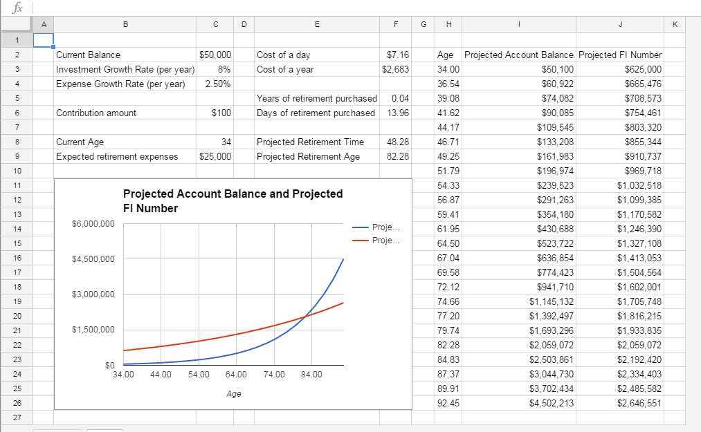
Everything is sized pretty well; now we just need to do some intuitive coloring and we’ll be all done!
Step 3 - Color the Chart
In general, I try to make my spreadsheets intuitive so that the person using them knows what they need to enter and what they are just supposed to read. The last thing you want is to accidentally blow away a formula by typing over it because you thought you were supposed to enter something!
I typically keep input cells with a white background and change everything else on the page - this makes it pretty clear where inputs go. With that in mind, highlight the whole sheet (click on the gray box to the left of column A and above row 1),
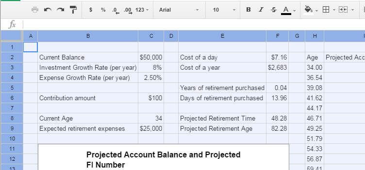
Next, use the paint can icon to choose a background color. I’m going to pick a light blue:
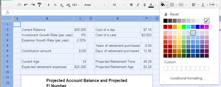
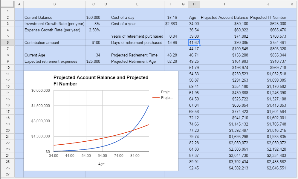
Here’s what your page should look like now:
Now let’s flip our inputs back to white so they stand out. click on C2, then hold shift and click on C3, C4, C6, C8, and C9. Click on the paint bucket and pick white
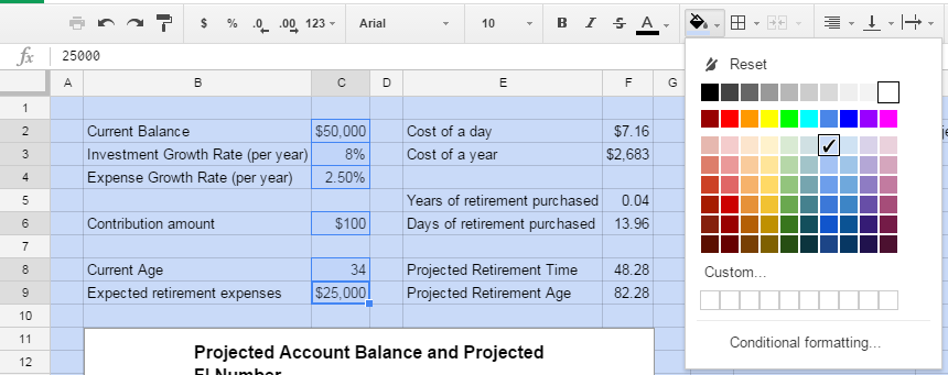
That’s looking better.
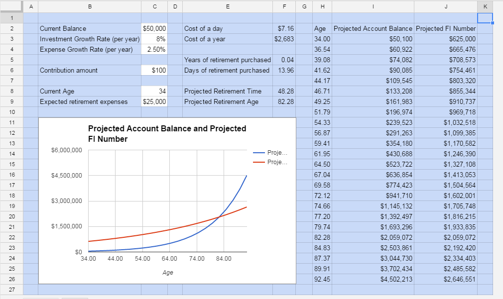
Now that you’re comfortable changing background colors, let’s do that for the input labels, as well as the output labels, outputs, and the data table we use for our chart. Pick some contrasting colors as you please.
If you pick a dark color, you may also want to change the font color to a light color for readability. You can do this by using the font color icon (just to the left of the paint bucket):

Here’s how I styled my version of the sheet:
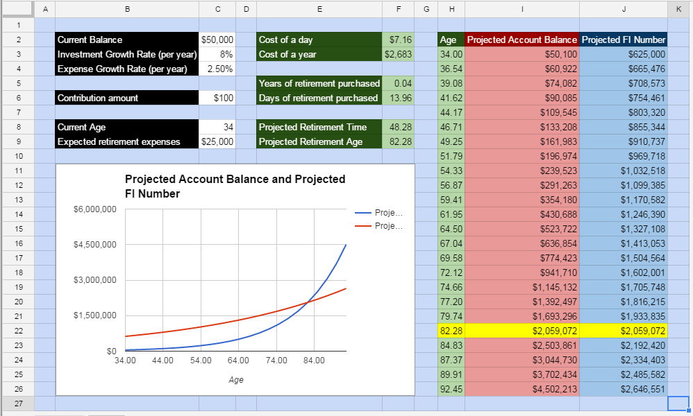
Note that I highlighted the data table row for our retirement date in yellow so we have an additional indicator of when the financial independence age in our example hits.
We’re almost done. While gridlines are great to guide you when creating a spreadsheet, I find they create visual clutter in the “whitespace” that you can get rid of once you’ve got a structure in place. Turn gridlines off by unchecking “Gridlines” under “View”
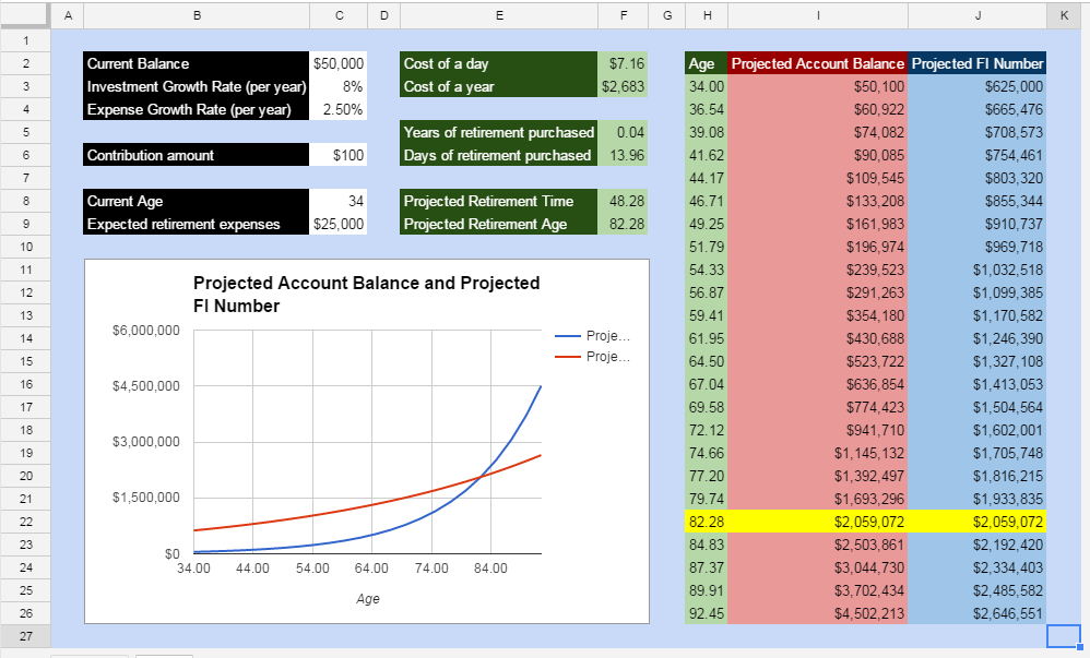
I do think gridlines look good for groups of cells that have common information (i.e. inputs, outputs, and data tables)
To put gridlines back for these a set of elements, select the grouping of cells (i.e. B2 to C4) and then click on the border icon. I like softer border colors, so I’ll change mine to the same blue tone as our background. Use the border pen color icon to choose an alternate color.

Now that we’ve selected the color, we can go ahead and put the borders in by selecting the “all borders” option in the border dropdown. Repeat for each grouping and here’s what you’ll get:
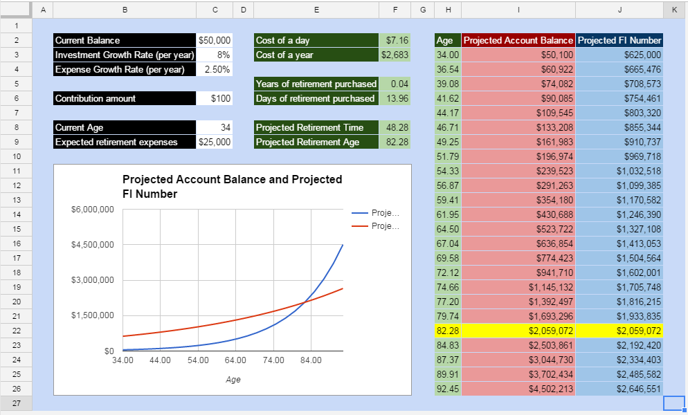
It’s not the Mona Lisa, but it isn’t bad either :)
There are just one more optimization/tweak to make our dashboard a bit more polished. Let’s tackle that and then we can step back and enjoy what we’ve created.
Step 4 - Final Optimization
You may have noticed that the labels for our chart are cut off because of where they are placed (squished into the right side).
You can fix this by putting the legend at the bottom. Click on the chart, then the legend, and click on the dropdown that says “Right”; change this to “Bottom”.
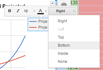
Got it? We’re good to go!
Final Product

Well done! You put together quite the spreadsheet dashboard here. As you went through this, I hope you learned a few spreadsheet tricks as well that you can apply elsewhere.
From here, I leave the rest to you - play with the numbers to better understand your financial picture, play with the formatting to make the dashboard even prettier, or add some new formulas and visualizations for understanding today’s impact on your retirement.
CHALLENGE: If you’re up for it, try adding another column of data to the data table (and corresponding line to the chart) showing the account balance without the extra contribution. To really get intense, you could show a zoomed in chart on the timeline where the two intersect with the expected expenses line to visualize the impact of that contribution even better.
If you come up with some cool options or any additions to the sheet, let me know in the comments below or contact me - I’d love to hear what you come up with. Happy spreadsheeting!
